The profit-enhancing magic of decluttering your ecommerce website

In Marie Kondo’s bestselling book, The Life-Changing Magic of Tidying Up, she evangelizes the benefits of reducing clutter. By encouraging people to keep only what most sparks joy, she helps people tidy up and find happiness. At Rokt, we believe that this same logic applies to the ecommerce checkout experience.
Ecommerce companies have so much to offer: app downloads, free shipping, multiple payment options, insurance, warranties, 3rd-party offers, customer feedback surveys, co-branded credit cards, and more. However, these messages can quickly create clutter, leading to a poor experience that overwhelms your customers. This phenomenon – that an abundance of options causes anxiety rather than happiness despite people thinking the reverse – is known as the paradox of choice.
Understanding the paradox of choice: why an abundance of options creates clutter
Before examining how tidying up your ecommerce website checkout is good for business, it’s important to understand the psychology behind the paradox of choice and how many of us unknowingly experience this regularly in everyday life.
Anyone who subscribes to a streaming service such as Netflix can surely relate to scrolling through options for ages before finding something to watch. Are you in the mood for a happy-ending romance or an action-packed drama? Movie or sitcom? Before you know it, an hour has gone by and you’re still wandering through the Netflix catalog. By now, you’re overwhelmed and might just decide to go to bed instead. Or, you make a seemingly random selection out of frustration but are still feeling unsatisfied thinking of all the other options you’d rather be watching (AKA buyer’s remorse). This stressful experience is the result of the paradox of choice.
To an extent, choice is good. After all, a Netflix catalog with only two choices would hardly be successful. However, too much choice becomes clutter and leads to discontentment.
The challenge of clutter in ecommerce
While brick and mortar retail products are limited by the physical constraints of in-store shelf space, online retailers can display ten times the amount of products on their sites. There is almost limitless real estate available in the digital space, which is why so many ecommerce sites are plagued by the paradox of choice. With so much space, it is easy to accumulate clutter.
There are three main areas where the paradox of choice can hurt ecommerce sites: the homepage, the cart, and the confirmation page. Listed below are ways you can fully optimize your site in these three areas to improve customer experience.
Homepage
Many sites attempt to engage customers by enticing them with several buttons to click, bright images, or animations. But this can be disorienting and have the opposite effect.
- Keep things simple: Visually complex sites are consistently rated as less beautiful and effective than their simpler counterparts.
- Limit CTAs: Too many Call To Action buttons make a shopping experience overwhelming and lead to decreased conversions. Reduce the CTAs on your ecommerce site by focusing only on the CTAs most relevant to your customers.
Cart
The cart is the last place you want to overwhelm your customers with an abundance of choices. Many vendors are tempted to overload this page with product upsells, loyalty programs, and more, but this can have the opposite effect and result in a high percentage of cart abandonment.
Research shows a staggering 69.57% of consumers, on average, abandon their online shopping carts before completing a purchase. 42% of potential buyers abandon carts because they were overwhelmed by too much choice. Decision paralysis is a key contributing factor here.
- Personalize your offers, products, and services: Space for engagement at checkout is limited, so it is best practice to only show offers, products, and services that are relevant to shoppers and will enhance their experience.
- Simplify your checkout page: Overwhelming customers while they are making a purchase leads to cart abandonment. Combat this by using the space to create a seamless experience with key information and limited distractions.
Confirmation Page
The confirmation page is often overlooked in ecommerce, but it provides brands an untapped opportunity. Research shows that consumers are at their happiest on the confirmation page and they are more likely to engage with related offers at this stage.
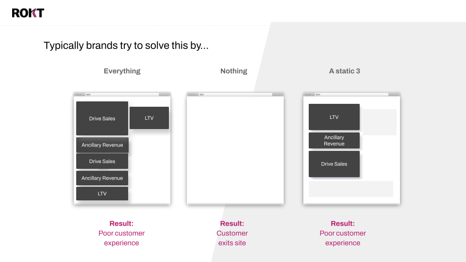
Most companies often use this real estate in one of three ways: they show nothing (which is a missed opportunity), they show everything (which overwhelms users), or they show three static options that are not relevant to the particular customer on the page (which is a poor customer experience).
Just as it doesn’t make sense to promote a winter coat sale to customers in Hawaii, showing an app-install promotion to a customer who already has your app creates both a poor customer experience and is a missed opportunity to show them something else they might enjoy more.
The best way to tidy up this page – and combat the paradox of choice – is to present customers with only the most relevant offers, personalized to them.
Tidying up your ecommerce website: the Rokt solution
At Rokt, we help companies declutter their ecommerce checkouts to overcome the paradox of choice. Instead of presenting your customers with everything you have to offer, leverage Rokt’s machine learning to tailor high-performing, relevant experiences to each individual based on information gathered from your first-party data. The result? A better customer experience, which leads to higher engagement that results in added profit for your business.
To learn more about how Rokt can help you declutter your ecommerce website checkout and increase conversions, learn more here or talk to an expert!